Client
Yoo The Barber
Overview
Yoo the Barber, formerly part of a successful salon duo, embarked on a new solo venture after a personal and professional turning point. Seeking a visual identity that reflected his transformation and resilience, he turned to us to help redefine his brand. The goal: a striking, elegant logo that captured his personal story without falling into overused barber clichés.
Client
Yoo The Barber
Service
Logo Design
The Challenge
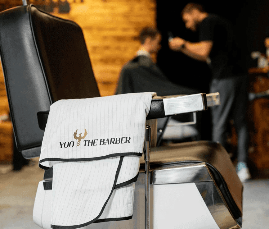
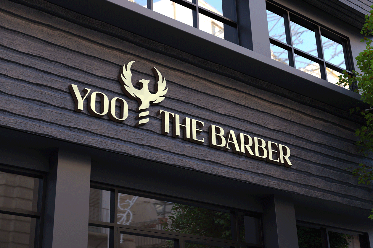
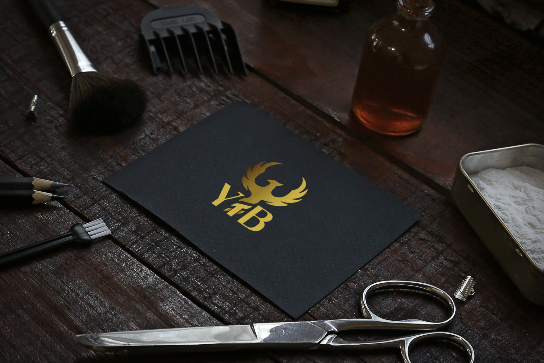
Yoo wanted to break free from the generic barber shop visuals: no scissors, razors, or spinning poles. He envisioned a premium, minimal identity in black and gold, something with meaning and presence. The challenge was to create a logo that would embody his rebirth, honor his craft, and stand out in a saturated market - all while staying true to his understated, elevated style.
The Solution
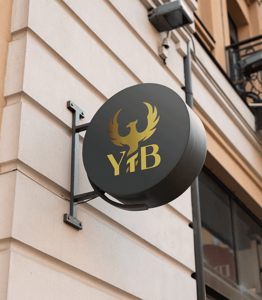
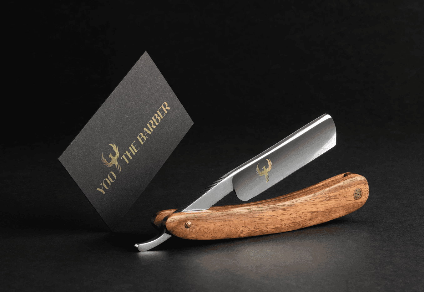
I leaned into Yoo’s personal journey and drew inspiration from the phoenix, a symbol of rebirth and transformation. The resulting icon features a stylized phoenix with its tail subtly incorporating three stripes (a quiet nod to the traditional barber pole, hidden in plain sight). The color palette focuses on black and gold to evoke luxury and strength. For the short-form logo, I designed the initials “YTB” with the “T” seamlessly integrated into the phoenix’s tail, where the top of the “T” doubles as one of the subtle barber stripes.

The Result
The new brand identity delivers on elegance, storytelling, and individuality. Yoo the Barber now has a logo that reflects his evolution, a symbol that speaks to his personal rise and professional ambition. The branding reinforces his premium positioning while staying rooted in authenticity and intention. Subtle yet powerful, classic but personal - just like his craft.